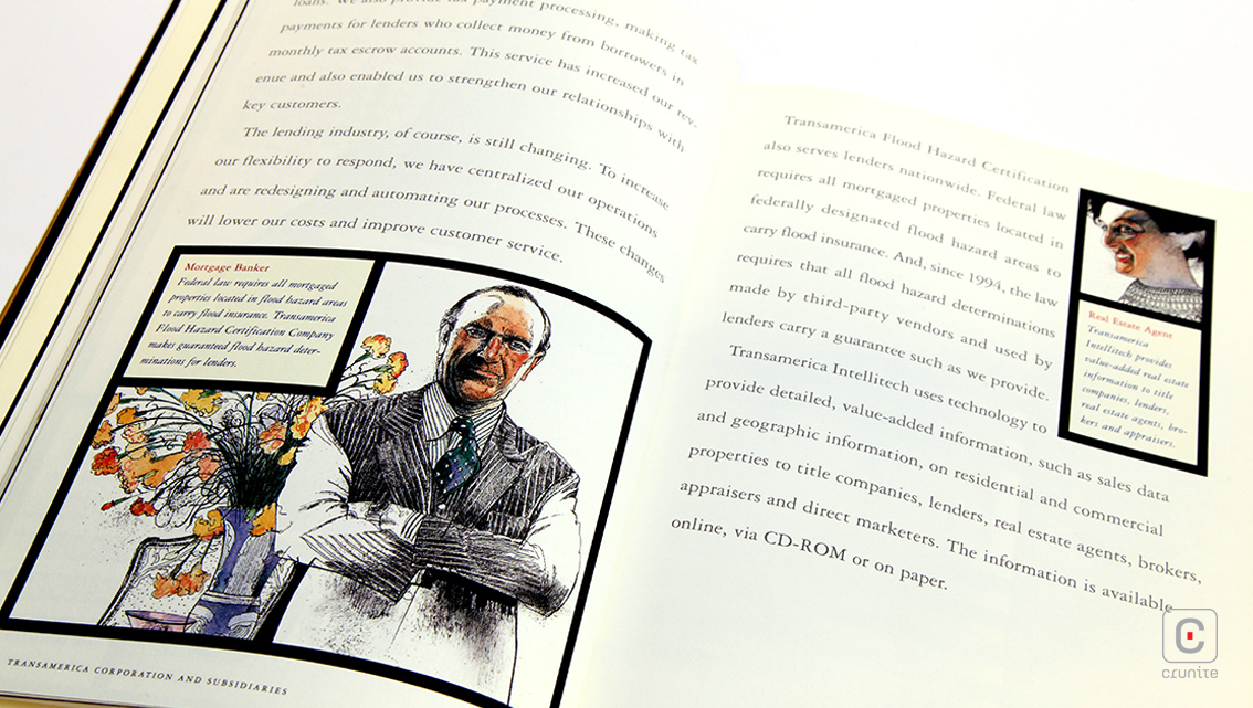
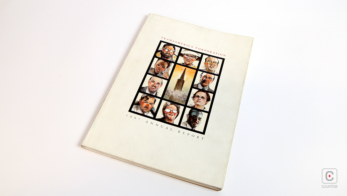
The Transamerica Corporation operates a variety of insurance and investment companies. An old American firm, Transamerica traces its roots back to 1904 and remains in the public consciousness partly due to its iconic, futurist skyscraper, The Transamerica Pyramid. This building is therefore rather sensibly placed in the centre of the cover of Transamerica’s annual report, surrounded by portraits of people the reader will encounter in the report.
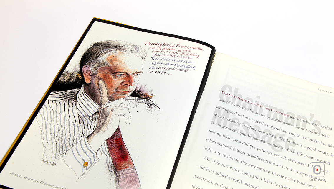
The vitality he brings to a portrait is as remarkable as ever in his work for Transamerica. His deft linework makes the images sing and his trademark ink splatter serves to lend the report a gritty realism. As was his custom, his images often incorporated text in his own handwriting and this technique, used in an annual report provides a sense of immediacy to the portraits.
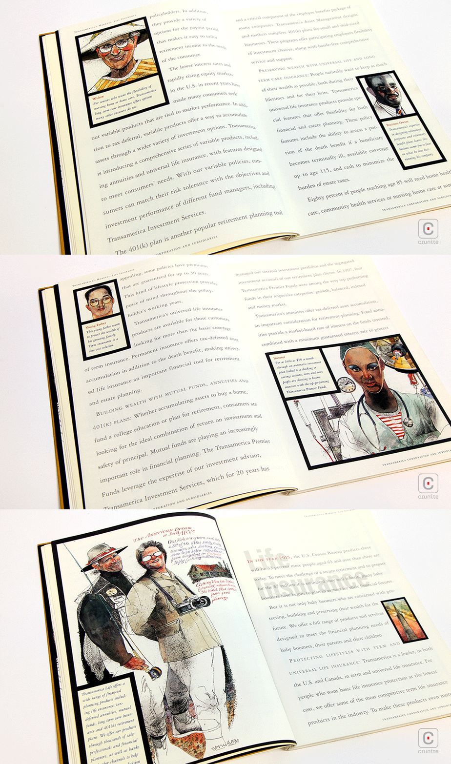
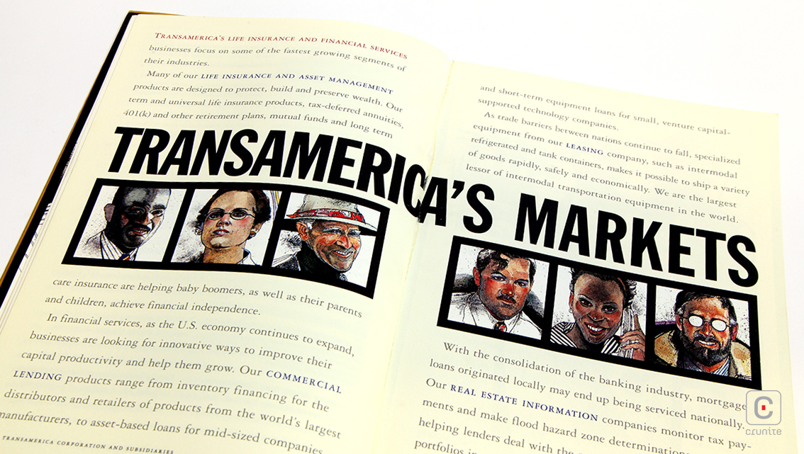
The design of the pages uses a thick black frame for each of Unruh’s portraits and this firmly directs and settles the eye – useful, given that many of the portraits are reproduced at (unfortunately) small sizes. A pleasing contrast with the thick black ‘picture frames’ is created by the use of a lightweight sans serif, in light gray when set large and with wide leading when set small.
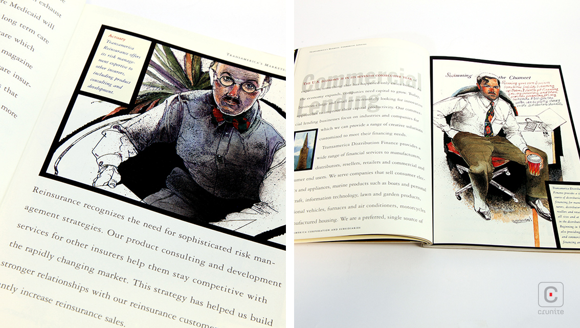
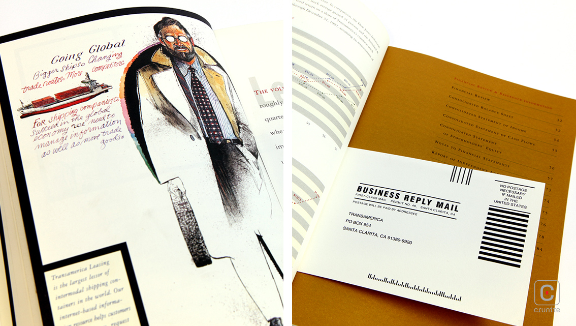
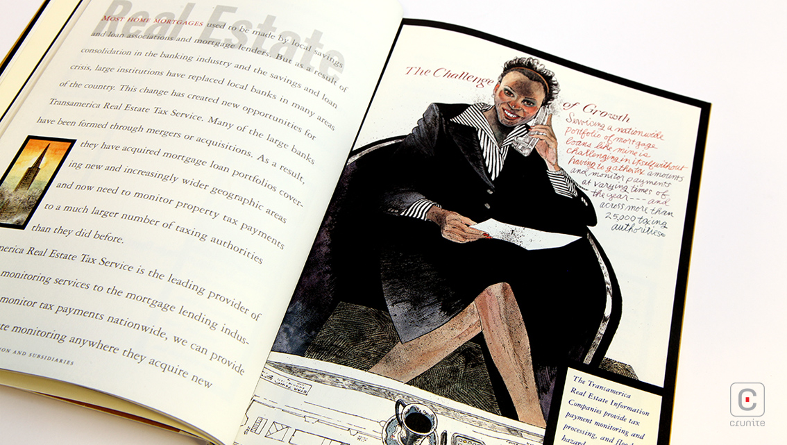
The financial section of the report makes restrained use of a four-colour palette (red, blue, yellow, black) to guide the eye, helping the reader navigate the numbers with ease. Uncoated, off-white paper makes for a soothing reading experience and when the report is finished, there’s always the portraits to go back to.
