
American multinational conglomerate, General Electric (GE) is no stranger to imagination or innovation. Its 2016 Annual Report, which comes in an interactive online format is proof of that.
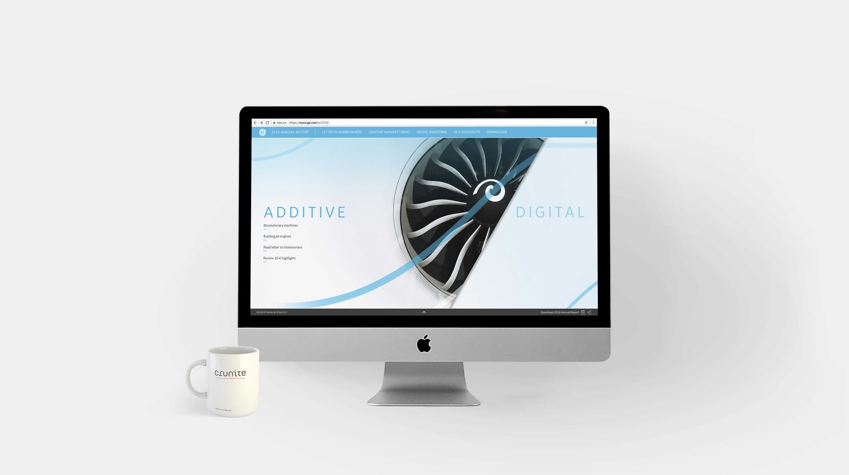
On first view, two intriguing words – Additive and Digital – split the screen into two. The transition between the two is made via a sliding graphic showing the cross-section of a jet engine – a reference to one of the many areas GE operates in.
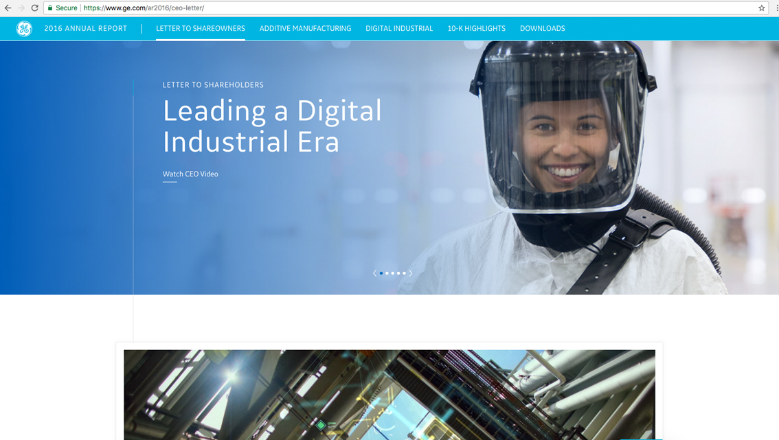
Clicking on a sub-section then opens up a breath-taking visual treat, in the form of a navigable 360-degree panorama that shows employees at work within the diverse operations of the company. The moving figures help add to the authenticity of the experience. Labelled bubbles pop up throughout the screen, offering tantalising detours into further specifics, which range from statistics to descriptive texts. The innovative interface does take some getting used to, though.
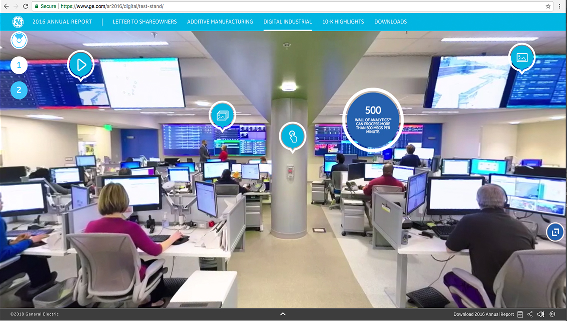
Blue is the dominant colour and it is ingeniously used, such that it appears on components ranging from the textual (headers) to the visual (in garments worn by the featured employees).
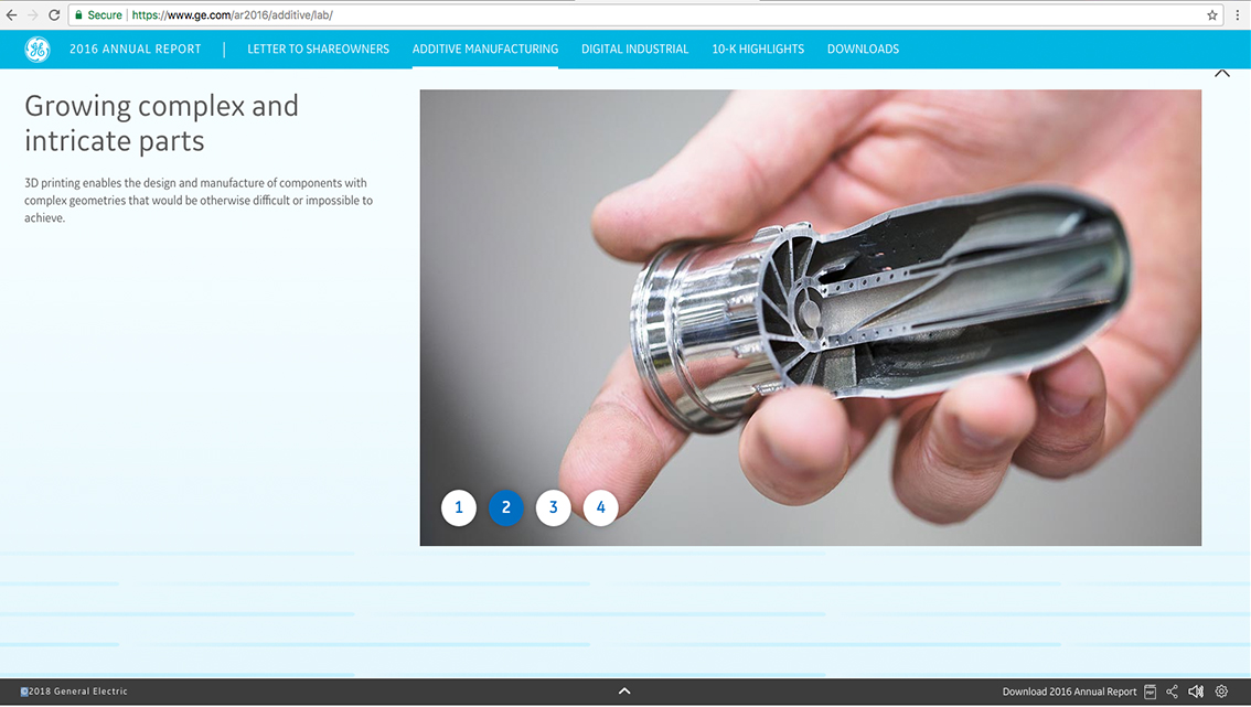
The report uses a sans serif typeface throughout –GE Sans, a patented font created for the company by Bold Monday, and utilised from 2014 onwards.
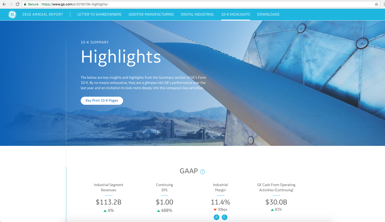
Video, without any headings, is utilised throughout the report – in ‘information bubbles’ to explain the many facets of the company’s manufacturing processes, as well as in the CEO’s address.
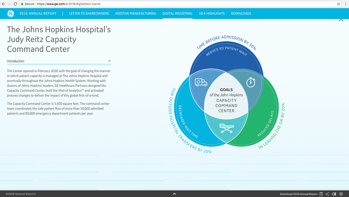
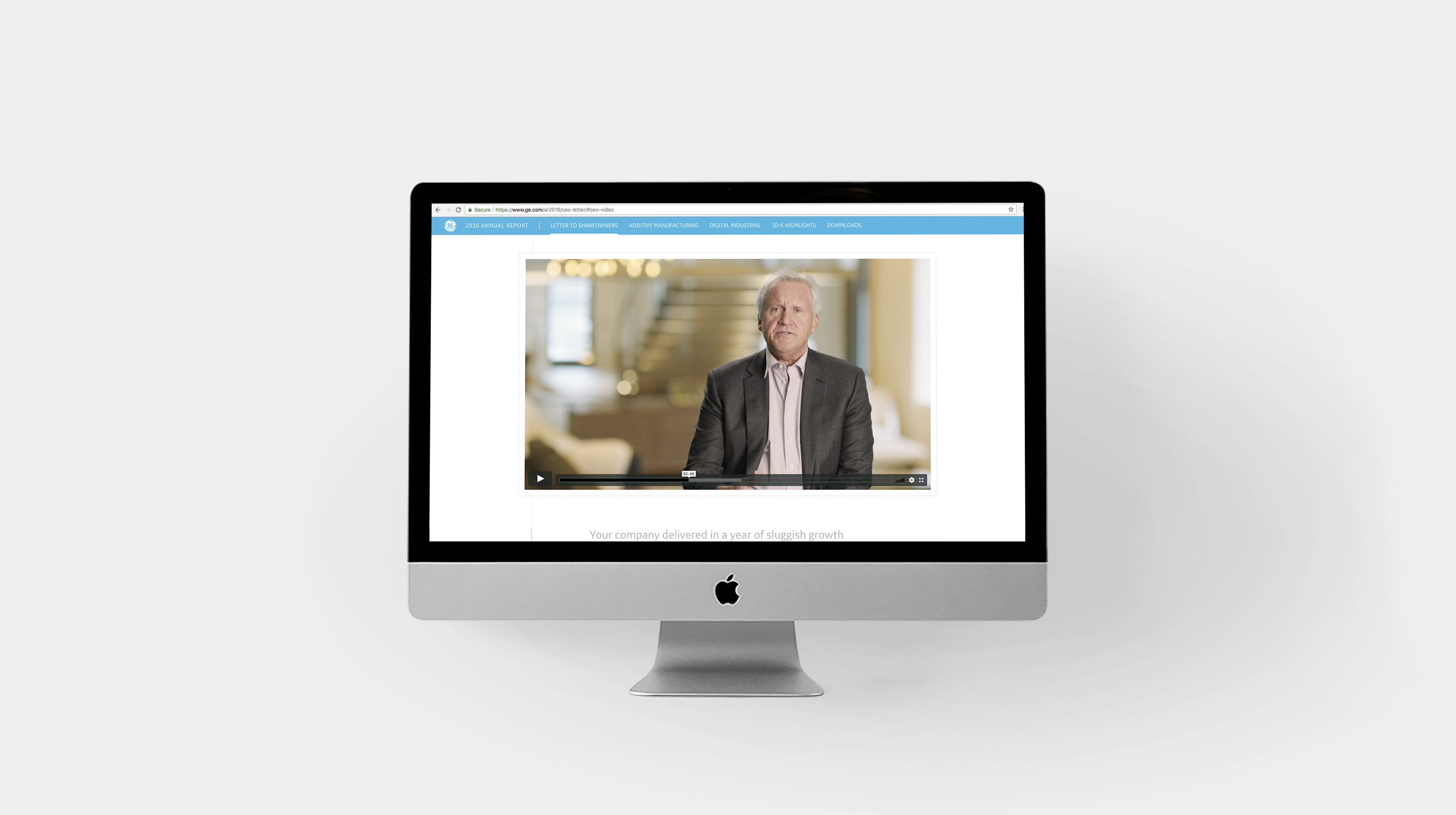
The report uses sophisticated language and this is most evident in the text that accompanies the CEO’s video-message. Here, lofty ambitions are laid out and considering the powerhouse that GE is today, such a style is very well deserved.
The report sums up its offering by allowing readers to create a personalised, downloadable PDF version of the online report, by incorporating any sections of choice.
Back
