Established in 1922, Vinmonopolet (‘the wine monopoly’) is a Norwegian state-run alcohol retailer. To tell its story in 2017, Vinmonopolet’s annual report makes good use of illustration, colour, and typesetting.
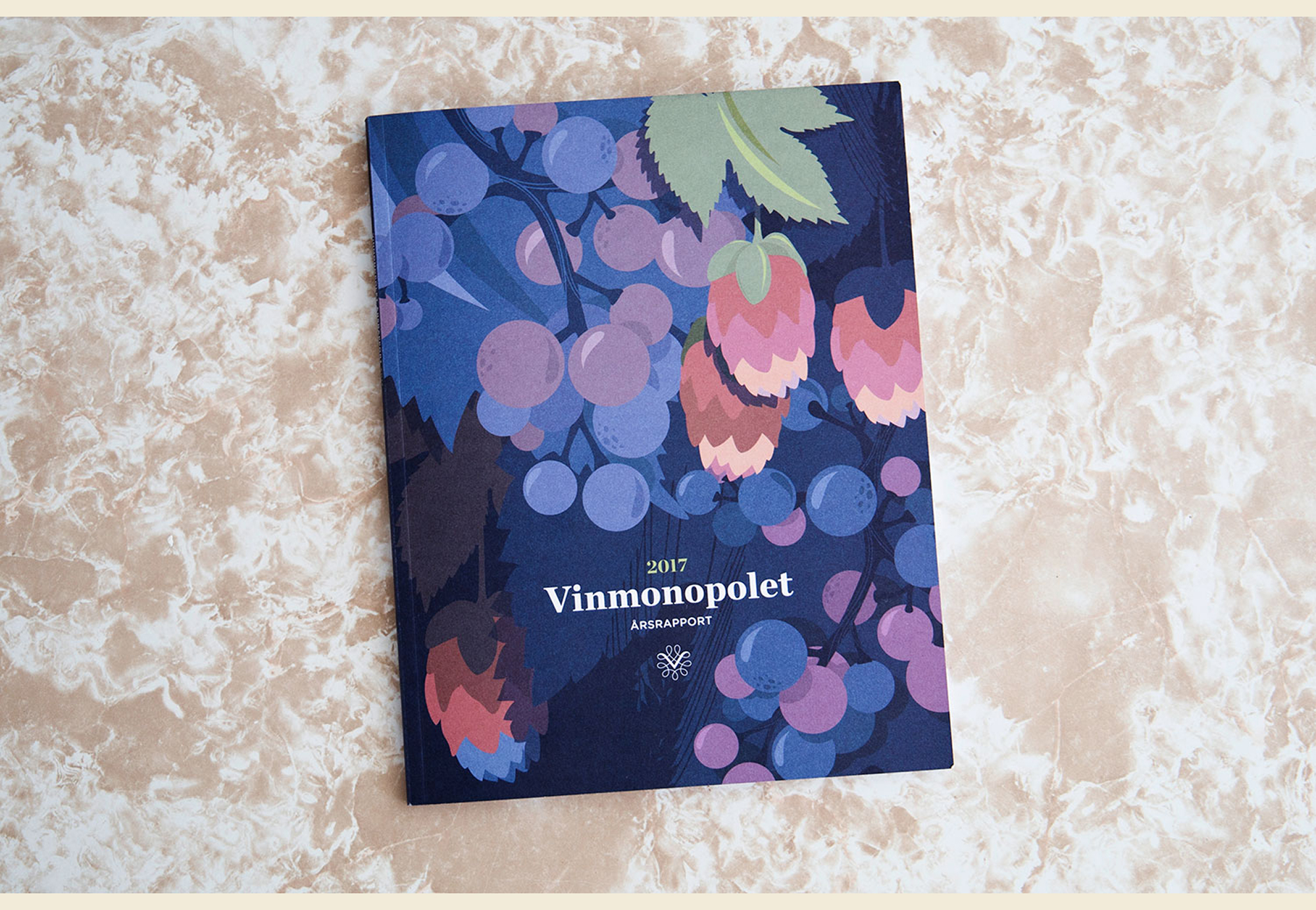
The report is illustrated by the London-based studio of Gilles & Cecilie, and is strongly reminiscent of the corporate art movement known as Corporate Memphis, popular in the 2000s. This style is characterised by simple shapes, flat and bright colour, and illustrations of people with limited facial features.
Here however, Gilles & Cecilie offer their own version of Corporate Memphis by using a warm, muted colour palette and finding a way to apply colour tones. They accomplish this latter effect by layering opaque colour, rather than blending it. The lack of blending perhaps honouring the artwork’s Corporate Memphis roots.
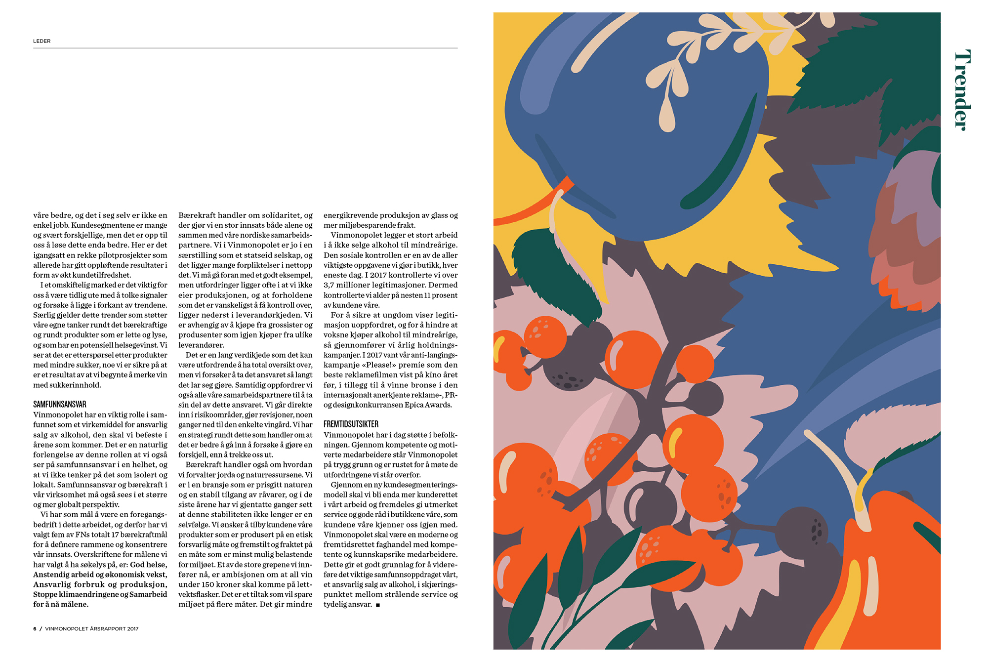
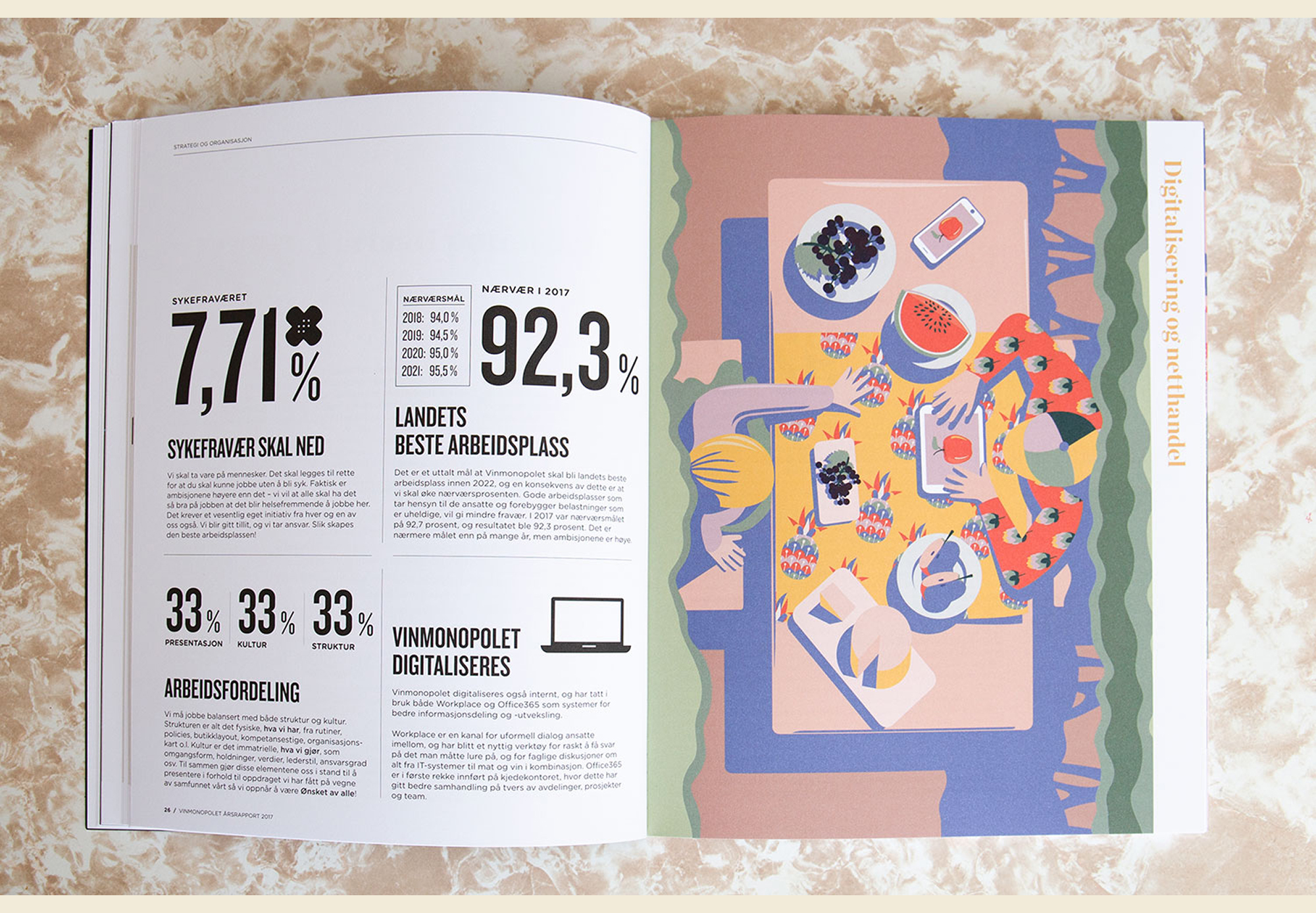
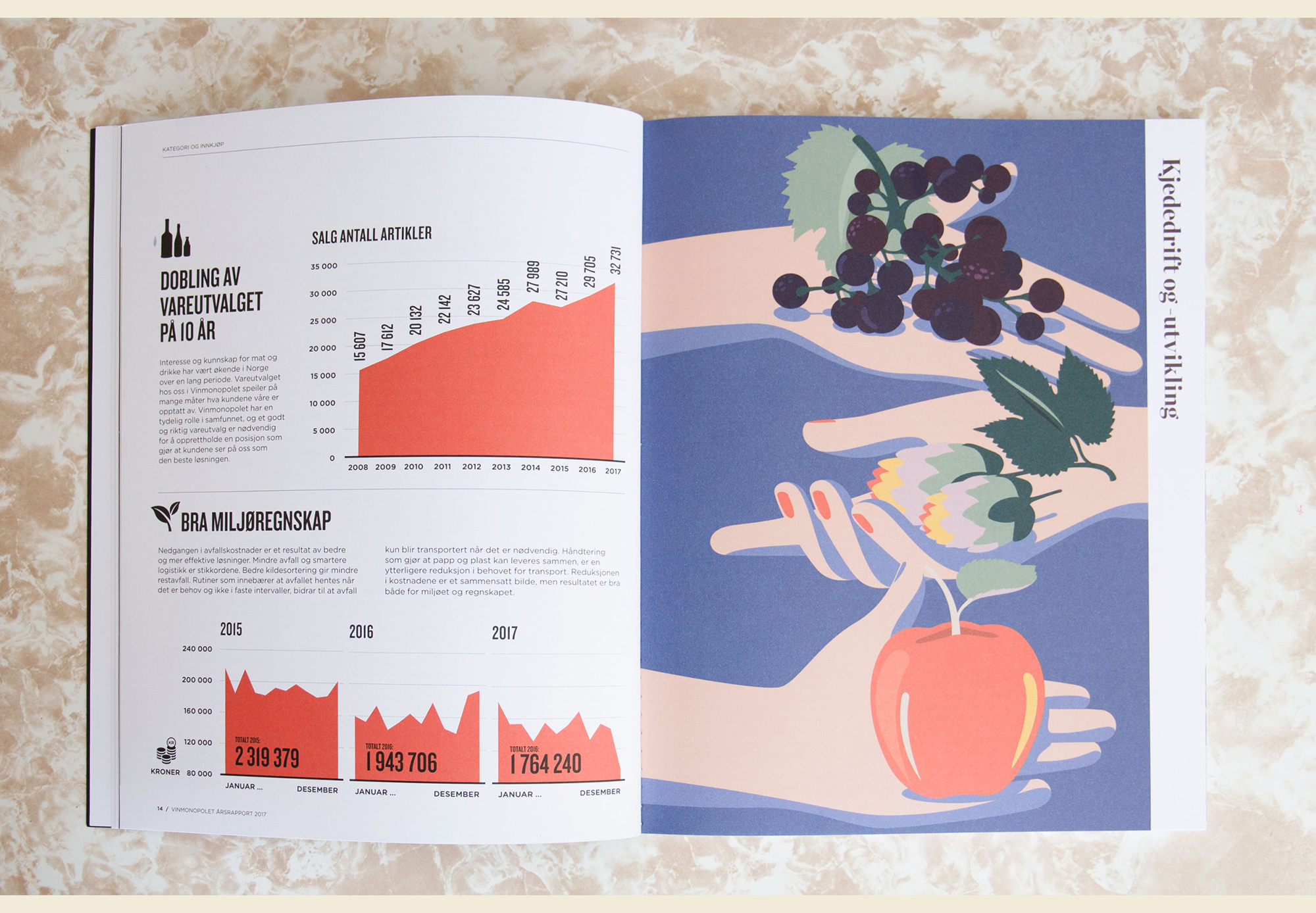
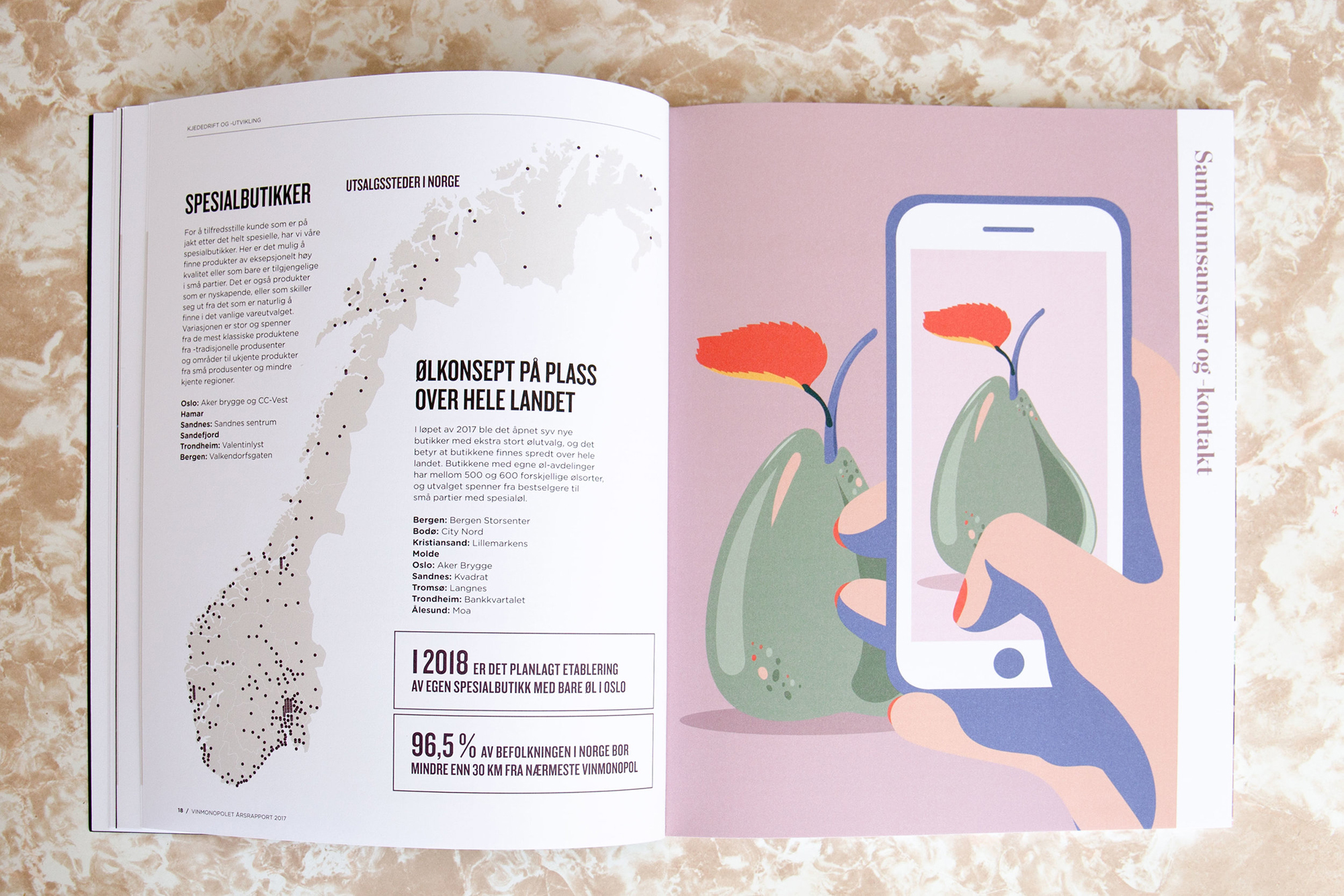
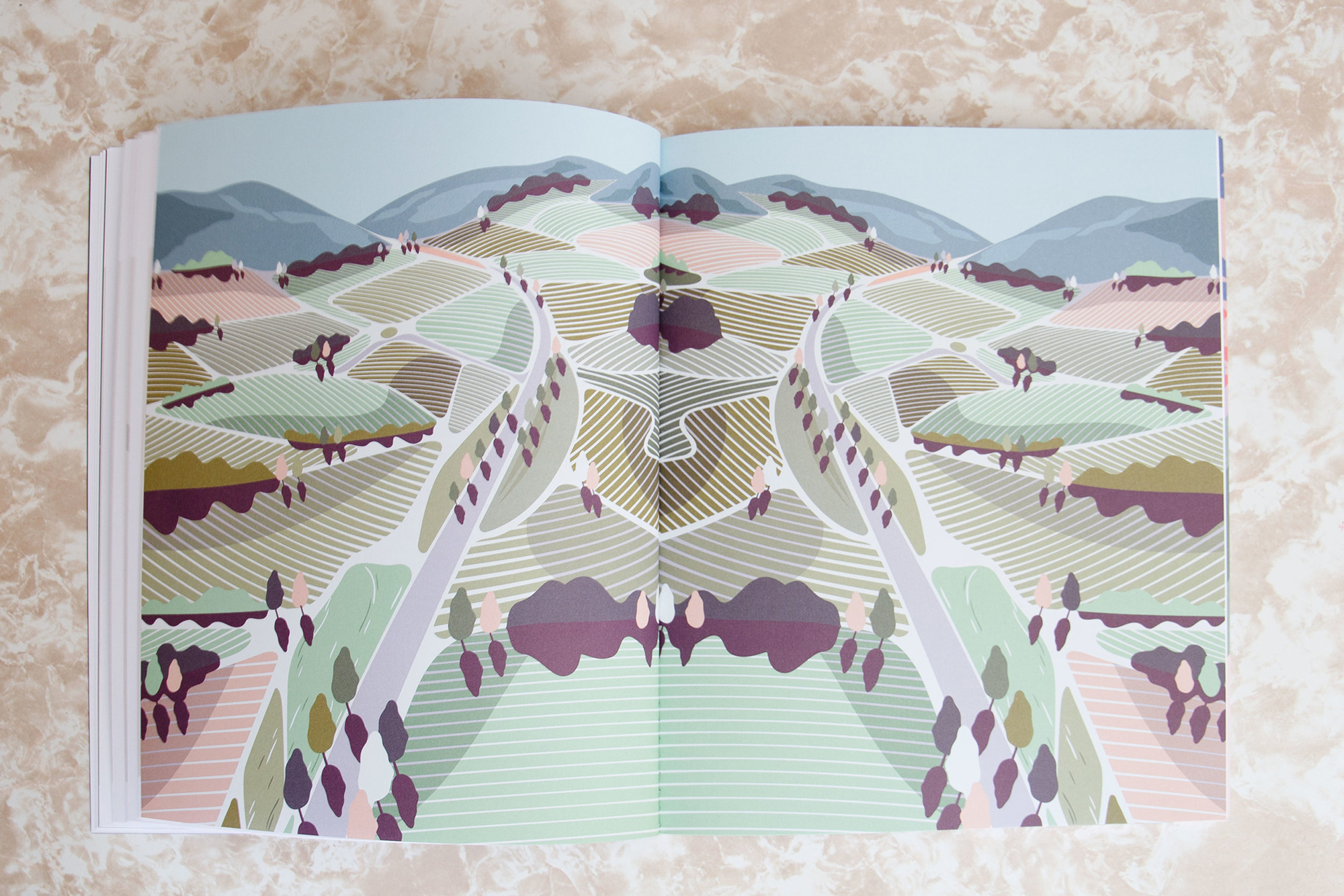
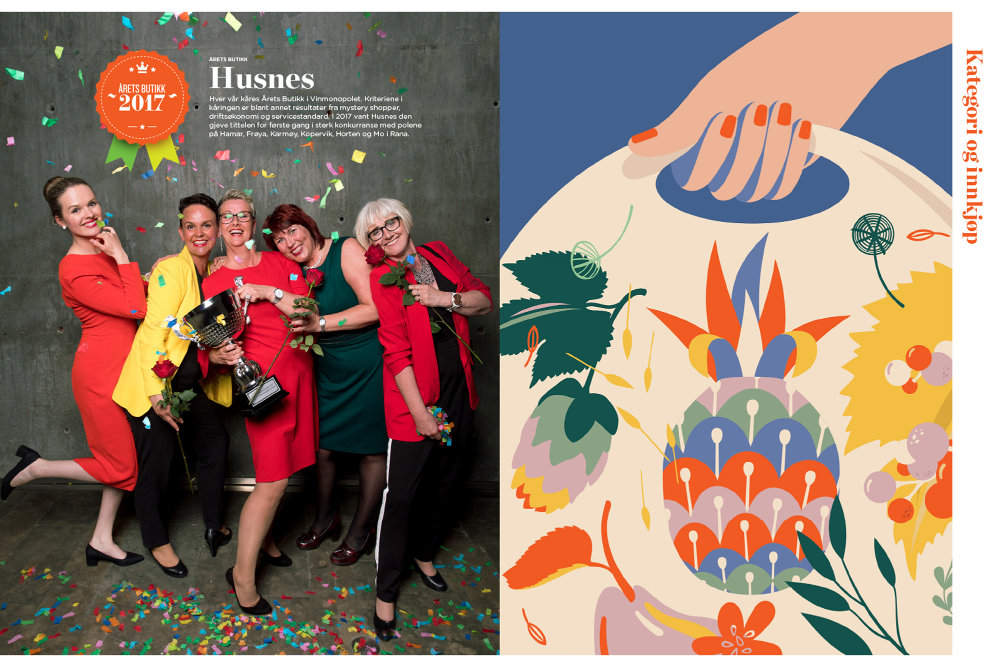
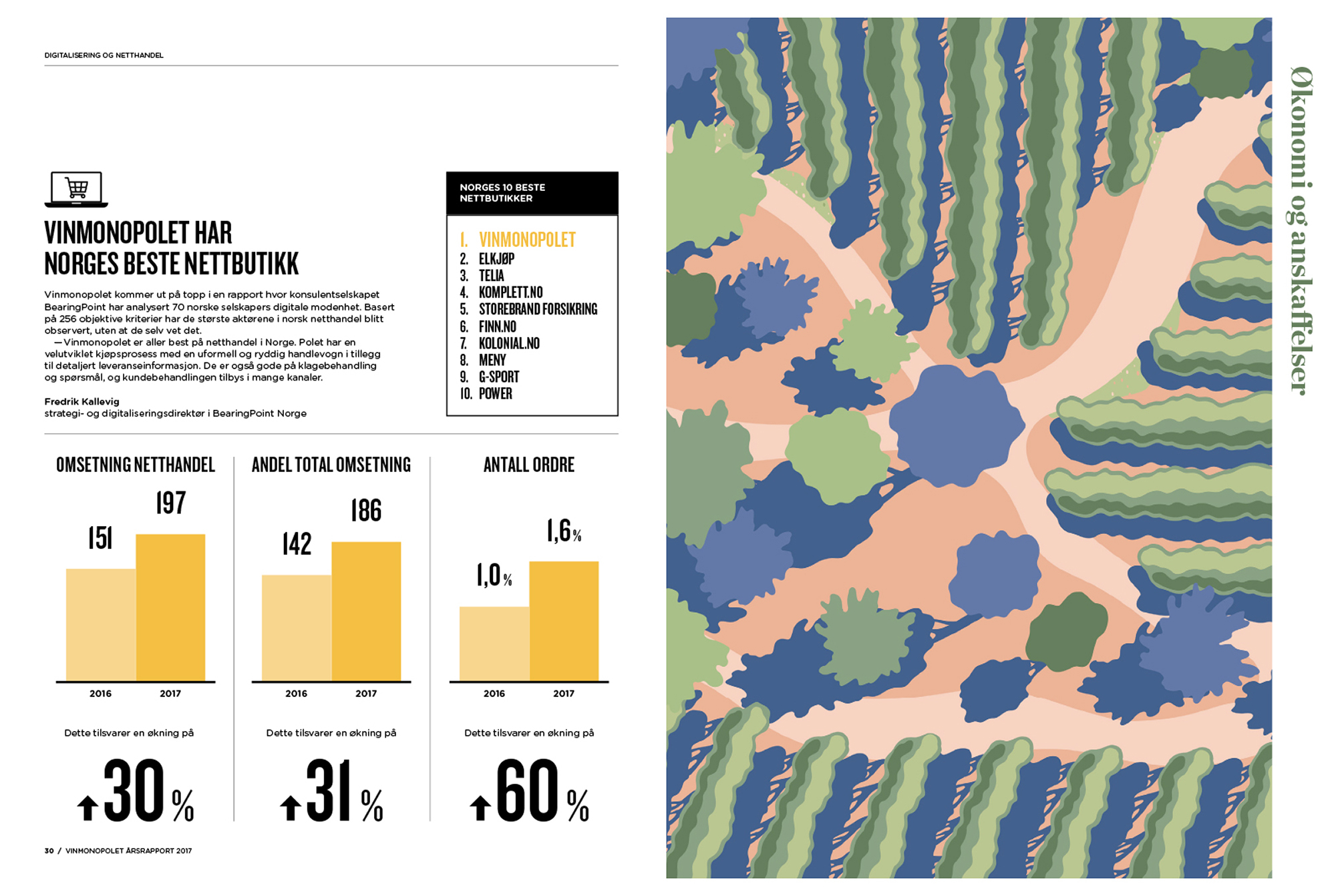
People are rarely represented in the art of this report. When they are, we are mostly shown their hands, or we see them from above, their faces not visible. This has the unusual effect of being impersonal—but because of the colour palette—warm at the same time. The landscapes in the middle of the report are lovely and add a sense of place, unlikely though a Norwegian wine company may seem.
The type treatment involves a narrow sans serif and a modern, cheerful serif. The serif is used for body copy and while the leading is a tad tight, the line breaks are worth considering. These are numerous. Coupled with tightly-leaded type this allows the design company—Dinamo—to create sharply defined, rectangular negative space within the columns (which they use to house pull-quotes). Visually, this is appealing, but is not the easiest to read, given the weight of the serif. These gentle experiments in typesetting and the riff on Corporate Memphis make this a report worth studying.
![]()
![]()