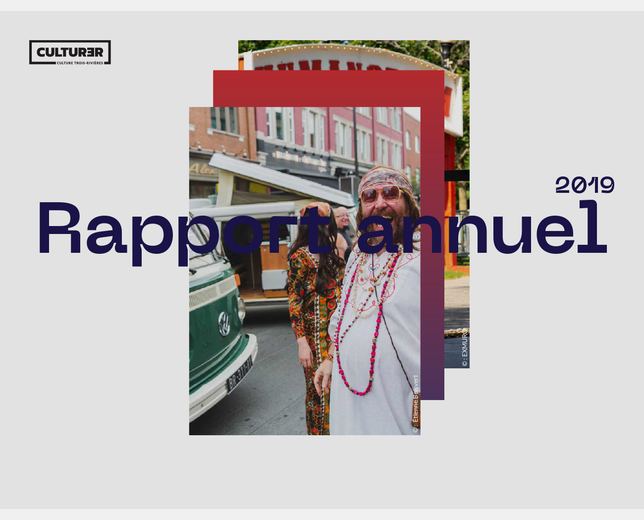
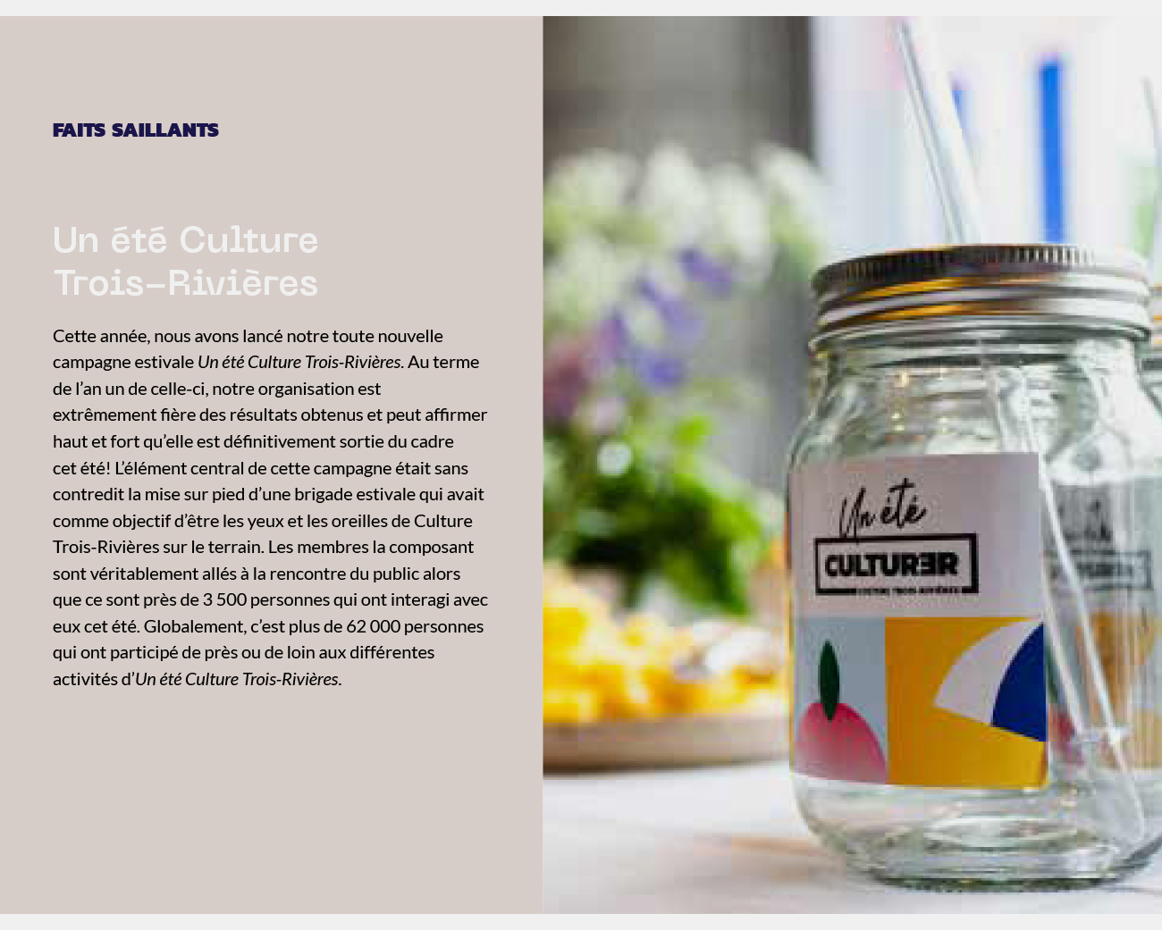
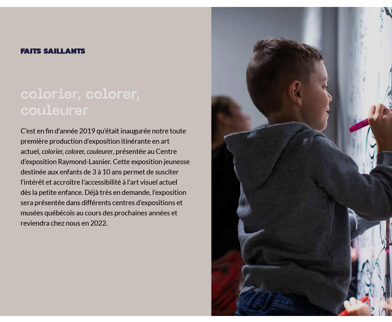
Established in 1997, Culture Trois-Rivières is an organisation that promotes the arts and culture of the Canadian city of Trois-Rrivières. Their 2019 annual report features a unique type treatment and makes good use of the horizontal format.
The key typeface in the report is a distinctive, modern typeface that borrows elements of slab-serif design and combines them with curved letterforms. This results in type that is a pleasure to look at and stands out as belonging to the brand.
The horizontal format has become popular in recent years and here, it is used to maximum effect. Title text and pull-quotes sprawl across the space and yet, when applied to a 2-column grid, sits comfortably opposite photographs of Culture Trois-Rivières’ activities in the city.
This is a short report and it is organised in such a way that it is easy to browse. Placing emphasis on the typography is a wise choice and if continued in subsequent reports, could easily become a defining feature of the organisation.
![]()
![]()