
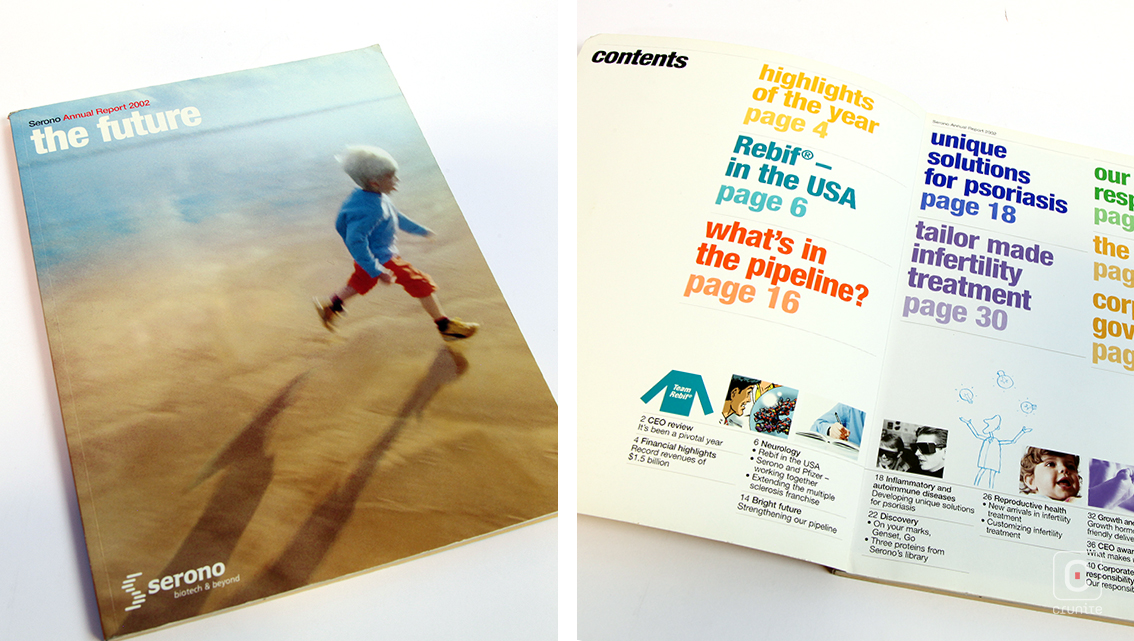
Serono was a Swiss biotechnology company acquired by Merck in 2006. The cover of its 2002 annual report shows a blurred photograph of an infant running across the seashore, obliquely conveying one of the company’s integral market segments – reproductive health.
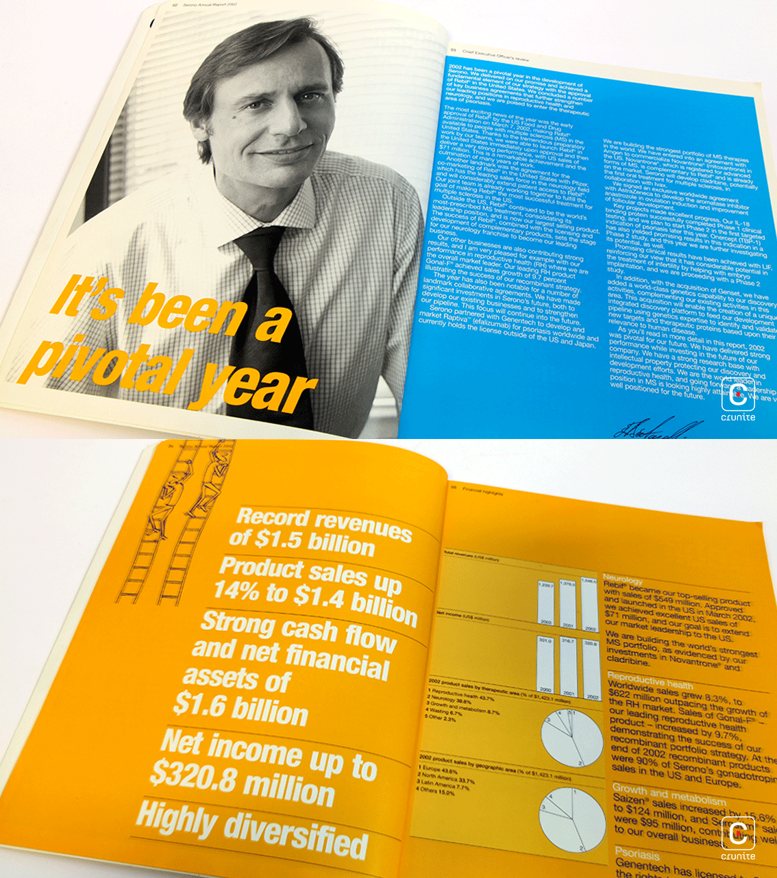
The report is split into two sections – the story of the organisation and the financial information. Using a perfect binding and matte lamination for the cover, the first half of the report is kind to the eyes. It is easy to read, thanks to the font and colours used. The second half is an attempt to minimise the monotony of white backgrounds that regularly accompany financial data. Here, financials are presented on a mustard yellow background with black text.
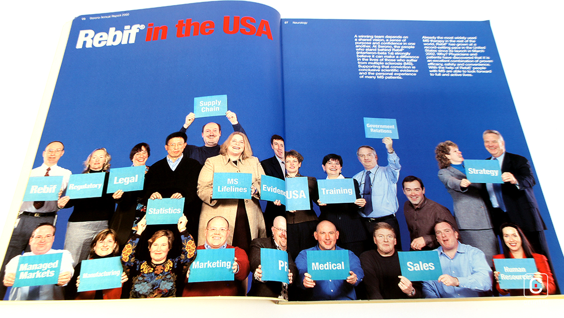
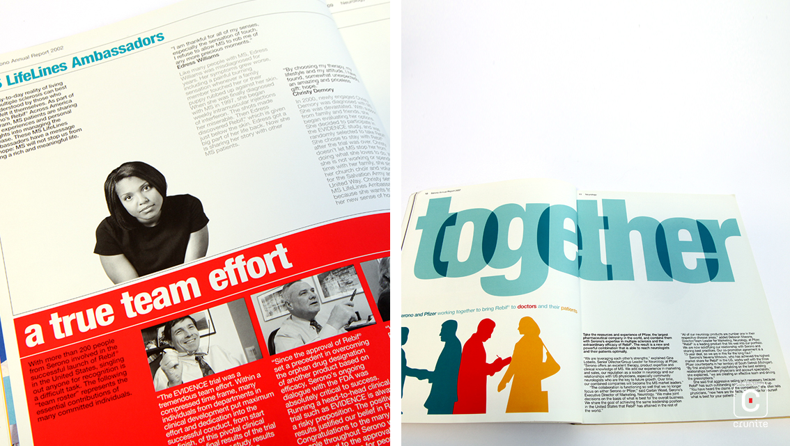
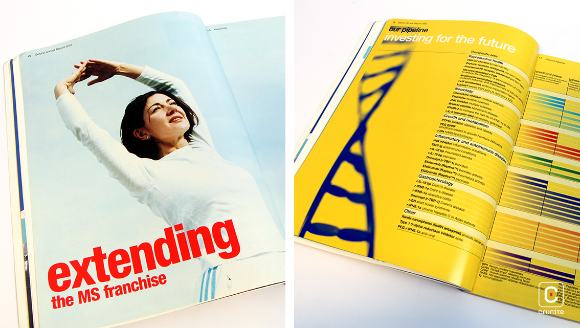
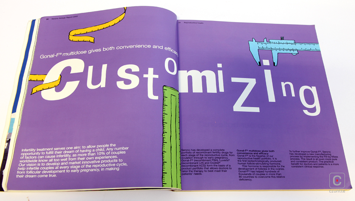
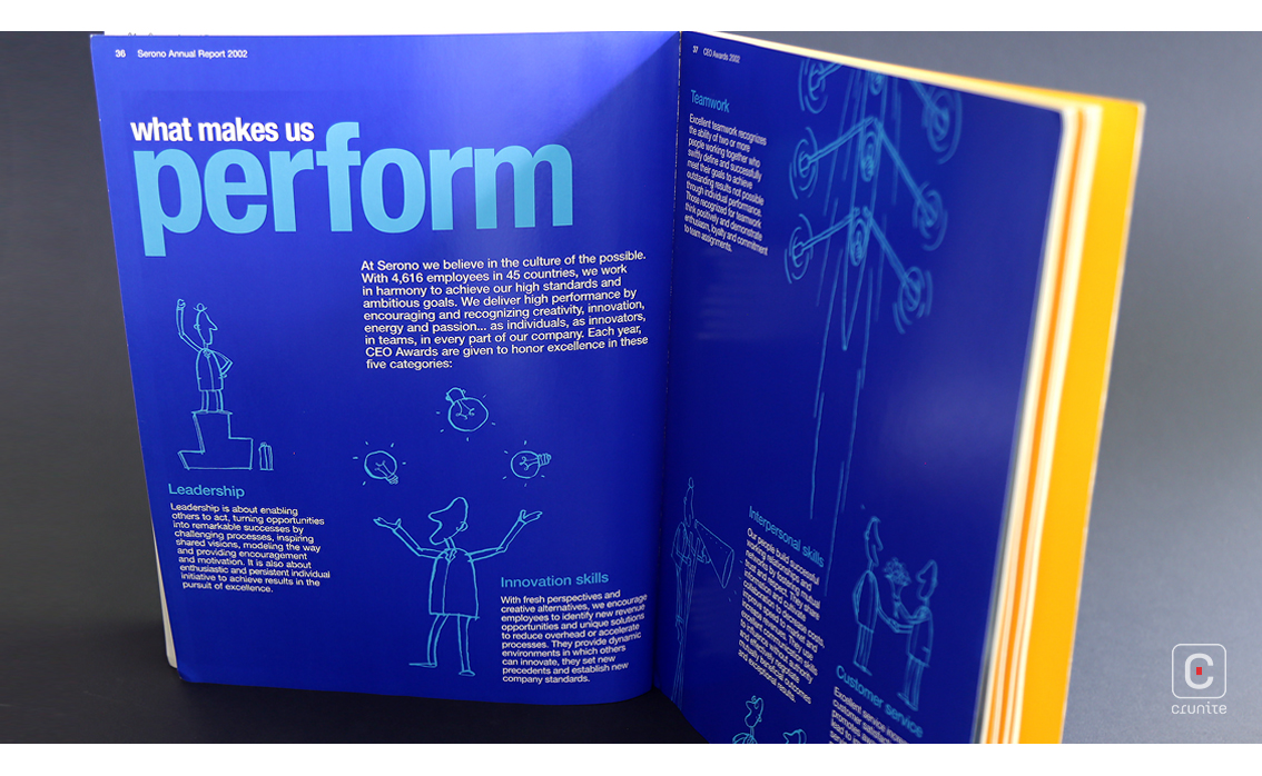
The rest of the report, however, plays freely with colour. The inner pages are an eclectic combination of photography, illustration and comics. Employing an assorted thematic style throughout, the report adds a pop of colour in what would otherwise have been sombre. Use of primary colours in generous proportions along with large font sizes enables this report to stand out as vivid communication collateral.
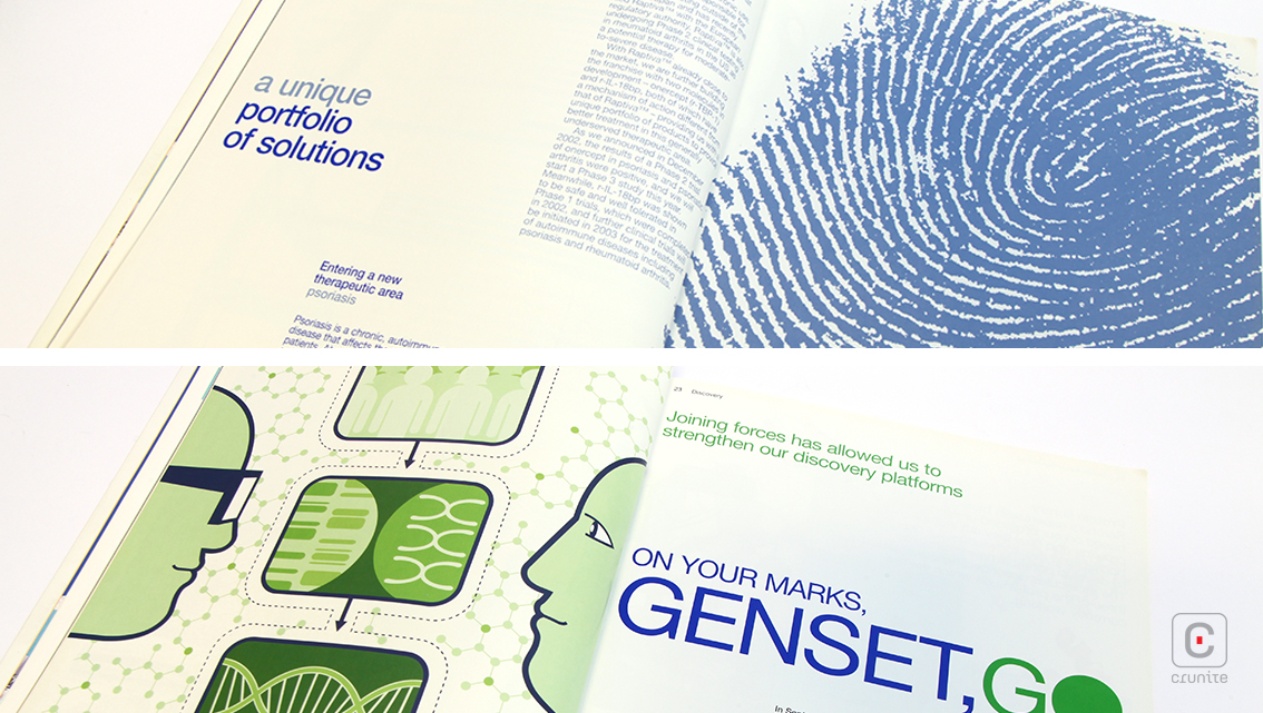
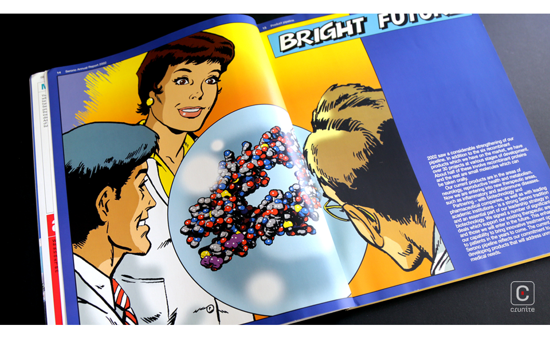
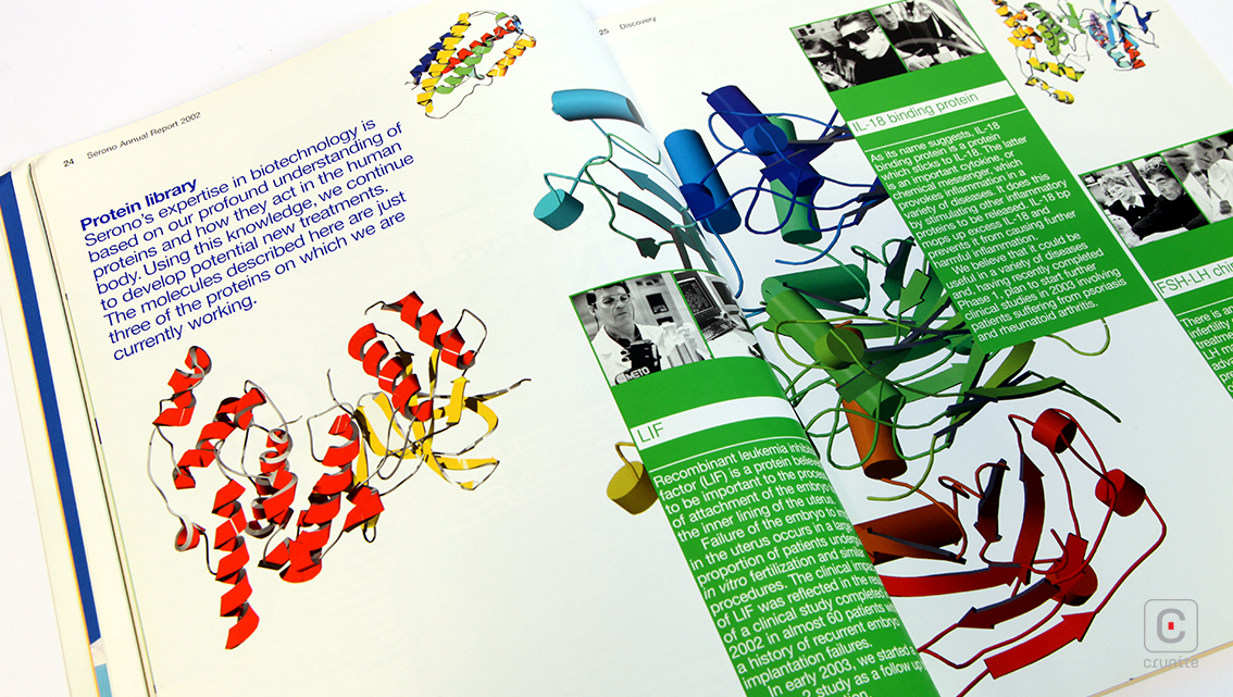
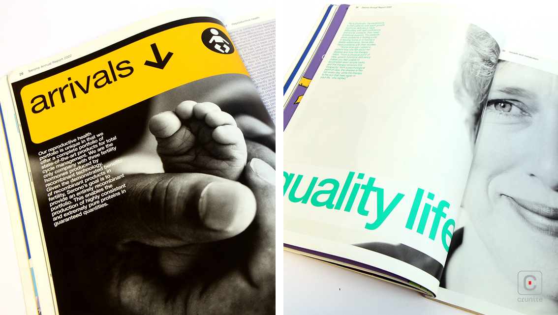
The copy is written in straightforward language to align it with the nature of the report’s theme. It is simple to understand and is accompanied by relevant images and drawings to convey its message. The staff of Serono is represented via photographs, capturing them in a laid back style and bordered by illustrations. This 112-page annual report offers an immense platform for imagination to stretch its fingers, from highlights of the year, to product verticals, to company accolades.
Back

